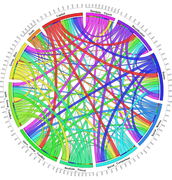
We all know what a Venn diagram looks like. We use them to represent how a population is distributed across three overlapping groups. However, what do we use when there are four, five, or even a hundred groups? We have created the Venn Magnet Diagram. This diagram can dynamically adjust to present these otherwise complex “landscapes” of population distribution.
Conceptual Framework
Decision-makers need to understand complex human group behaviour to predict the consequences of their actions. Such an understanding can take years to develop. The conceptual framework was developed in collaboration with a large group of leading international researchers who understand the state of the art in this area. Their understanding was then used to create a visualisation to quickly inform key decision-makers.
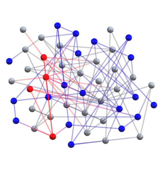
Adversarial Influence Maximisation in Partially Observable Networks
Social network theory can represent the propagation of any idea from media campaigns to modern terrorism. This research looked at how to maximise an idea’s influence when compared to another competing idea, in a network that is only partly known. Our work focused mainly on the visualisation aspect. We created a force-directed graph in virtual reality with an interactive competitive element.